Visualization

Beauty is an experience, nothing else. It is not a fixed pattern or an arrangement of features. It is something felt, a glow or a communicated sense of fineness.
D. H. Lawrence
Tableau Public
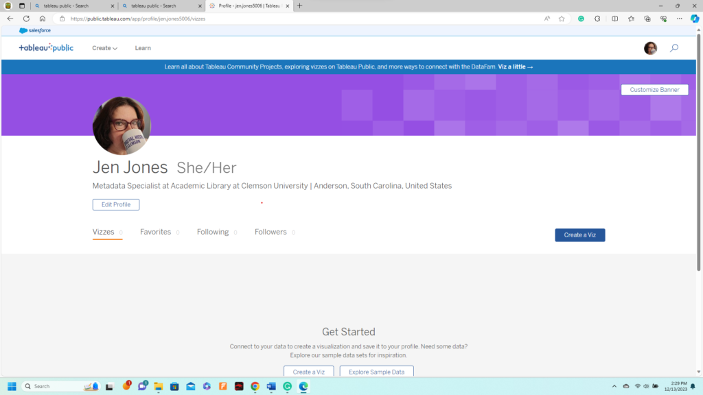
One frustrating aspect of this class is I wish I had more time to work with each tool. Tableau Public is one of them. I think I’ll use some winter break to test the tools further. I’ve started an account in Tableau Public with my “Clemson Digital History” coffee cup. This is the sort of platform that helps people connect, but in this case, with research and findings. You can put it together in a visual display of data. For a Historian, Tableau Public would be a way to connect to other people and their research. A big part of becoming an academic is understanding that connecting with others and reading others’ research is essential. History is a way that theories build upon each other. It isn’t someone hidden in the archives, at least not always. I’ve been getting a Viz from Tableau Public for weeks and will get more involved. It’s an easy application to begin and is exciting. Once it is set up and I get more engaged in the community, I believe this will be a way to keep connected with other researchers and use some colorful and expressive visuals of my data.
Voyant Tools
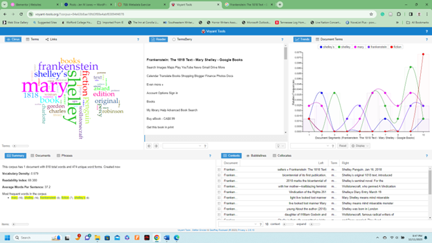
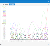
At first, I thought Voyant was just an enjoyable app with colorful and exciting data visuals. I used the book Frankenstein by Shelley as my corpus. And I created a word map. I’ve seen these sorts of designs with fonts and words before. But I never thought about how the size held any importance. After realizing the amount of word data in my corpus and how quickly it showed me the tally of how many times a word was used in Frankenstein! I began to think more about how a Historian can use such data. One of the most critical tasks Voyant could do is date words based on a corpus of varied periods. Language changes over time, and words can mean something completely different. The application itself is straightforward to use. You feed in your data, books, websites, and anything with words, and you are given numerous ways to show which words are used most. I liked the Loom display the best, mainly because of how alive the data seemed, like a sound wave. This would be a great way to begin my research of milltowns and see how we express ourselves, which has changed.
Net.Create
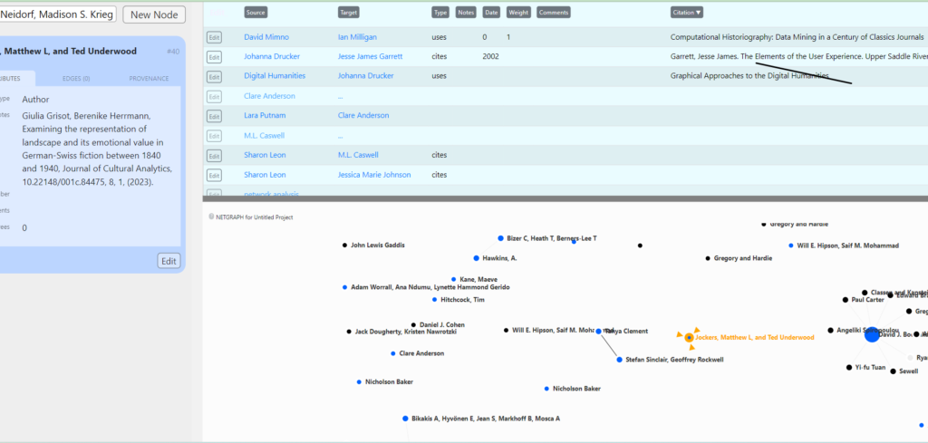
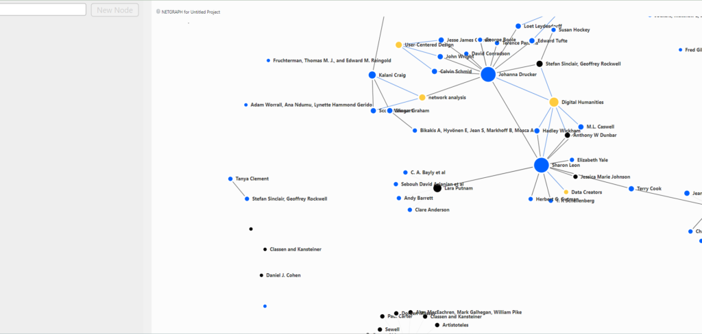
Our class was lucky enough to be able to see the beta version of Net.Create. This is another way of processing and visually sharing with others even at the same time. Each of us was given an author and date from our reading, and then simultaneously, we started adding our data. By the time the lab was over, it looked like a universe. Braches from everyone were created as an analysis of our reading. So, one huge plus for Net.Creating can be done with a group of researchers, each contributing. At the History Salon, we heard from one of the creators of Net.create. Dr. Kalani Craig. I immediately liked that she was a coder and also a Historian. We currently use many tools from the humanities but are not specifically coded to show historical data. Part of being a good historian is being able to creatively innterupt resources. But then having an application that is intended for historical study by a coder is appreciated. The whole process was very easy to use. My laptop’s battery died, so I could only participate in the lab’s first half. So, you can only see the first part of the project, but it should give you an idea of just how useful such a tool could be to academics and historians.
